2 An overview of tools for achieving web interactive plots in R
There are many R packages that create different interactive data visualisations. Many of these connect R to specific JavaScript libraries. These include Leaflet (Cheng, Karambelkar, and Xie 2017) for rendering interactive maps and many popular graphing libraries including highcharter (Kunst 2017), rbokeh (Hafen and Continuum Analytics 2016), googleVis (Gesmann and Castillo 2011) and the rCharts (Vaidyanathan 2013) package. These generate interactive plots or widgets known as htmlwidgets that can be viewed on a web page. Other tools use R rather than JavaScript to drive interactivity, including ggvis (Chang and Wickham 2016) and shiny (Chang et al. 2017). The few that are discussed in this section in detail are plotly (Sievert et al., n.d.), ggvis, shiny, and animint (Hocking et al. 2017).
2.1 plotly
plotly.js is a JavaScript graphing library built upon D3 (Bostock, Ogievetsky, and Heer 2011). The plotly package in R calls upon this library to render web interactive plots. The purpose of plotly in R is to provide a convenient way of creating interactive data visualisations (Sievert 2017b). With its API, we can generate a standard plot that can be shared and saved as an interactive HTML web page. One of the reasons why the plotly R package is useful is that it can automatically convert plots rendered in the very popular ggplot2 (Wickham 2016) package into interactive plots by simply applying the ggplotly() function to the plot drawn (see Figure 2.4). It provides basic interactivity including tooltips, zooming and panning, selection of points, and subsetting groups of data as seen in Figure 2.1. We can also create and combine plots together using the subplot() function, allowing users to create facetted plots manually or combine different sets of types of plots together.
Figure 2.1: plotly plot of the iris dataset
plotly::plot_ly(data = iris, x = ~Sepal.Width,
                y = ~Sepal.Length, color = ~Species,
                type = "scatter", mode = "markers")
Like many other htmlwidgets, plotly can provide interactive plots quickly to the user with basic functionalities such as tooltips, zooming and subsetting. In plotly, there are a lot of features for building different plots. However, while we can build upon layers of plot objects, they cannot be pulled apart or modified without re-plotting. These plots natively do not provide more information about the data nor be linked to any other plot. However, this can be achieved by combining these widgets with crosstalk (Section 2.1.1) or shiny (Section 2.3).
It is difficult to customise interactions without a knowledge of the D3, JavaScript and the use of the onRender function from the htmlwidgets package. The other difficulty for the majority of users is knowing which elements to target and how it has been defined on the page. Sievert (2017b) has shown an example of how a set of scatter points drawn with plotly can be selected via clicking which are linked to a google search page.
plotly is constantly being developed. As of writing, it has begun to expand on different methods of linking different views of plots and is able to create animated plots(Sievert 2017b).
2.1.1 Extending interactivity with crosstalk
crosstalk (Cheng 2016) is an add-on package that allows htmlwidgets to communicate with each other. As Cheng (2016) explains, it is designed to link and co-ordinate different views of the same data. Data is converted into a R6 SharedData object, which has a corresponding key for each row observation. When selection occurs, crosstalk communicates which keys have been selected and these widgets will respond accordingly. This all happens on the browser, where crosstalk acts as a ‘messenger’ between these widgets.
#transform our data into a shared object
shared_iris <- SharedData$new(iris)
#generate plots
p1 <- plot_ly(shared_iris, x = ~Petal.Length,
              y = ~Petal.Width, color = ~Species, type = "scatter")
p2 <-  plot_ly(shared_iris, x = ~Sepal.Length,
               y = ~Sepal.Width, color = ~Species, type="scatter")
#layout the plots on the page, along with the data table
p <- subplot(p1, p2)
bscols(
  widths = 12,
  p,
  datatable(shared_iris)
  )
In Figure 2.2, we have linked two plots generated by plotly with a table generated by the DT (Xie 2016) package. When we select over a set of points in one of the plots, the table will respond by filtering all the points that have been selected and this selection is also highlighted on the other plot. Similarly, if we highlight on the other plot, that selection should change and be updated. This creates a form of multi-directional linking between different views of the iris dataset.
Figure 2.3: Additional filtering and selection tabs using crosstalk
shared_income <- SharedData$new(income)
bscols(
  widths = 6,
  list(filter_checkbox("sex", "Gender", shared_income, ~sex, inline  = TRUE),
       filter_slider("weekly_hrs", "Weekly Hours", shared_income, ~weekly_hrs),
       filter_select("ethnicity", "Ethnicity", shared_income, ~ethnicity)),
  plot_ly(shared_income, x = ~weekly_hrs, y = ~weekly_income, color = ~sex, type = "scatter", mode = "markers")
)
In Figure 2.3, crosstalk can also be used for filtering. We can add specific inputs for filtering parts of our data set using sliders, checkboxes, and dropdown menus to allow more control over how we can subset and query our data.
However, crosstalk has several limitations. As Cheng (2016) points out, the current interactions that it supports are only linked brushing (Figure 2.2) and filtering (Figure 2.3) that can only be done on a single data set in a ‘row-observation’ format. This means that it cannot be used on aggregate data such as linking a density plot to a scatterplot, as illustrated in Figure 2.4 below. When we select over points over the scatterplot matrix, the density curves do not change as it cannot convert the selection into aggregated data.
Figure 2.4: A scatterplot matrix based upon the first five variables in the mtcars dataset
mtcars$cyl <- as.factor(mtcars$cyl)
shared_cars <- SharedData$new(mtcars[,1:5])
pl <- GGally::ggpairs(shared_cars, aes(color = cyl))
ggplotly(pl)
Sievert (2017b) explains that the densities do not update because there are no tools available in the plotly.js library or in the browser to recompute these densities. Similarly, aggregated displays including bar plots and box plots are not updated. However, it may be possible in a client-server framework such as shiny (discussed later in Section 2.3), where we can call upon R to do the calculation. Because the plotly.js library recently has support for certain statistical functions that can aggregate data, plotly has expanded beyond linking between row-observation data. As of writing, these are still being continually developed. One of the main limitations of using crosstalk together with plotly is speed - there is a certain time lag before a user completes their query via selection or clicks (Sievert 2017b).
Crosstalk only supports a limited number of htmlwidgets so far - plotly, DT and Leaflet (Cheng 2016). This is because the implementation of crosstalk is relatively complex. From a developer’s point of view, it requires creating bindings between crosstalk and the htmlwidget itself and customizing interactions accordingly on how it reacts upon selection and filtering. Despite being under development, it is recognised as being very promising. Other htmlwidget developers (notably, Kunst with highcharter(2017) and Hafen(2016) with rbokeh) have expressed interest in linking their packages with crosstalk to create more informative visualisations.
2.2 ggvis
Another common data visualisation package is ggvis (Chang and Wickham 2016). This package utilises the Vega JavaScript library (Trifacta 2014) to render its plots and uses the shiny framework to drive its interactions from R. It aims to be an interactive visualisation tool for exploratory analysis while following the “Grammar of Graphics” (Wilkinson 2005), similar to ggplot2 for static plots. It has an advantage over htmlwidgets as it expands upon using statistical functions for plotting, such as layer_model_predictions() for drawing trend lines using statistical modelling (see Figure 2.6 which shows the fitting of a smoother to the weight and miles travelled per gallon of specific cars in the mtcars data set). Furthermore, because some of the interactions are driven by shiny (Wickham and Chang 2016), we can add inputs that look similar to shiny such as sliders and checkboxes to control and filter the plot. We can also manually add tooltips as seen in Figure 2.5, which shows a basic ggvis plot of the iris data set with tooltips.
Note: the following are not interactive. They require a shiny back-end to become interactive. These images are static ggvis plots. Click here to view these examples.
ggvis(iris, ~Sepal.Width, ~Sepal.Length, fill = ~Species) %>%
    layer_points() %>%
    add_tooltip(function(iris) paste("Sepal Width: ", iris$Sepal.Width, "\n",
"Sepal Length: ", iris$Sepal.Length))ggvis(mtcars, ~wt, ~mpg, fill = ~gear) %>%
layer_points() %>%
layer_smooths(stroke:= "red", span = input_slider(0.5, 1,
value = 1,
label = "Span of loess smoother" )) %>%
layer_model_predictions(stroke:="blue",
model = input_select(c("Loess" = "loess",
"Linear Model" = "lm",
"RLM" = "MASS::rlm"),
label = "Select a model"))However, while we are able to achieve indirect interactions, we are limited to basic interactivity as we are not able to link layers of plot objects together. The user also does not have finer control over where these inputs such as filters and sliders can be placed on the page. We also cannot save these interactions to a standalone web page as ggvis plots are driven by the shiny framework which requires R. There is an option of saving the plot as a static plot, either in SVG or PNG format. To date, the ggvis package is still under development with more features to come in the near future. With ggvis, we can go further by adding basic user interface options such as filters and sliders to control parts of the plot, however this is only to a certain extent.
We cannot combine different views of data using ggvis, plotly and other htmlwidgets alone. Interactivity can be extended with these packages by coupling it with shiny.
2.3 shiny
shiny (Chang et al. 2017) is an R package that builds web applications. It provides a connection using R as a server and the browser as a client, such that R outputs are rendered on a web page. This allows users to be able to code in R without the need of learning the other main web technologies. A shiny application (RStudio 2017c) can be viewed as links between inputs (what is being sent to R whenever the end user interacts with different parts of the page) and outputs (what the end user sees on the page and updates whenever an input changes).
To show how this works, we have created a simple shiny application that has a slider that controls the smoothness of the trend line. Whenever the user moves the slider, the plot will be redrawn and updated with a new smoother. Figure 2.7 is a diagram showing of how inputs work with outputs in the shiny application in Figure 2.8.

Figure 2.7: A diagram showing how an input affects an output (slider to plot)
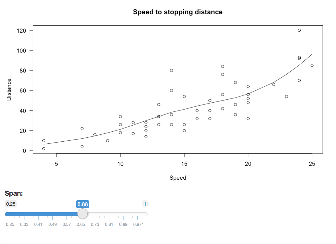
Figure 2.8: A simplistic shiny application that has a slider to control the smoothness of the trend line
This image is static. Click here to view this example.
These applications can become more complex when more inputs and outputs are added. The main advantage of using shiny is that it establishes a connection to R to allow for statistical computing to occur, while leaving the browser to drive on-plot and off-plot interactions (briefly defined in Section 1.1). This allows us to be able to link different views of data easily. Furthermore, RStudio (2017d) has provided ways to be able to host and share these shiny apps via a shiny server. However, we are still limited in the sense that for every time we launch a shiny application, we do not have access to R as it runs that session. Additionally, shiny has a tendency to redraw entire objects whenever an ‘input’ changes as seen in Figure 2.8. This can lead to unnecessary computations and traffic between R and the webpage slows down the experience for the user. Despite this, it remains a popular tool for creating interactive visualisations.
There are many different ways to use shiny to create more interactive data visualisations - we can simply just use it to create interactive plots or we can go further and use it to extend the interactivity in plotly, ggvis and other R packages.
2.3.1 Interactivity with shiny
shiny alone can provide some interactivity to plots (RStudio 2017a). Figure 2.9 shows linked brushing between facetted plots and a table of the nzincome data set. With shiny, we are able to easily link plots together with other objects. This is done simply by attaching a plot_brush input, and using the brushedPoints() function to return what has been selected to R. As we select parts of the plot, we see this change occur as the other plot and the table updates and renders what has been selected. Other basic interactions include the addition of clicks (plot_click) and hovers (plot_hover).
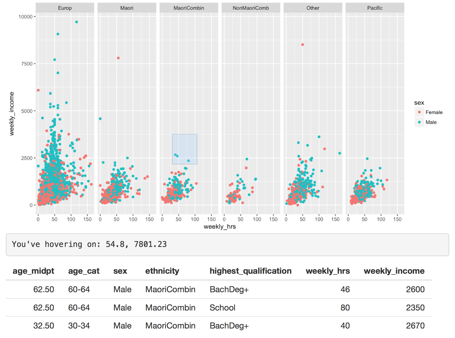
Figure 2.9: Facetted ggplot with linked brushing and hovers
This image is static. Click here to view this example.
However, these basic interactive tools only work on base R plots or plots rendered with ggplot2 and best with scatter plots. It is possible to extend this to bar plots, but it requires more thought. This is because the pixel co-ordinates of the plot are correctly mapped to the data (RStudio 2017b). When we try this on a lattice plot as seen below in Figure 2.10, this mapping condition fails as the co-ordinates system differs between the data and the plot itself. It is possible to create your own mappings to a plot or image, however it is complex to develop.
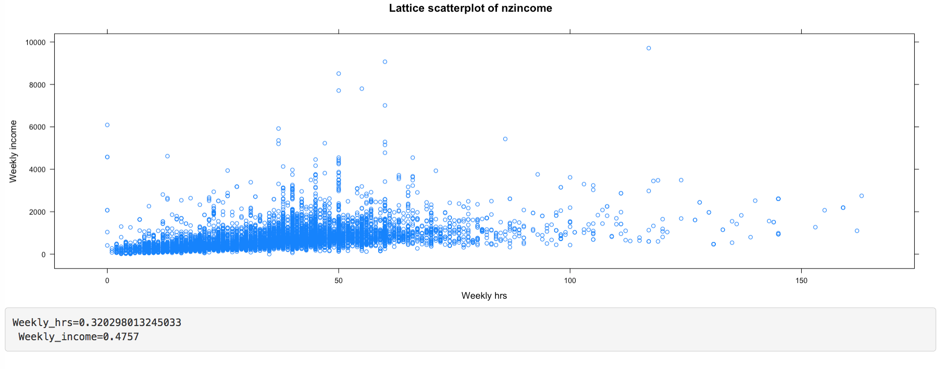
Figure 2.10: A lattice plot that fails to produce correct mapping
This image is static. Click here to view this example.
Because the plots are displayed as a single image, we can only view these plots as a single object and cannot pull apart elements on the plot. We are unable to further extend and add onto a plot, such as add a trend line when brushing or change colours of points when clicked on. Despite being limited to plot interactions such as clicks, brushes and hovers, we can use shiny to link multiple views of the data set.
2.3.2 Linking plotly or ggvis with shiny
Although shiny is great at facilitating interactions from outside of a plot, it is limited in facilitating interactions within a plot. It does not have all the capabilities that plotly provides. When we combine the two together, more interaction can be achieved with less effort.
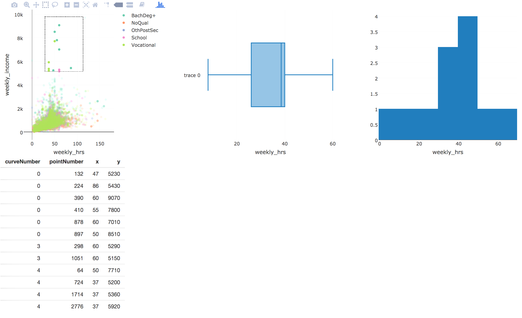
Figure 2.11: a Shiny app with a plotly plot with linked brushing
This image is static. Click here to view this example.
plotly (along with many other R packages that generate htmlwidgets) and ggvis have their own way of incorporating plots into a shiny application. In Figure 2.11, we can easily embed plots into shiny using the plotlyOutput() function. The plotly package also has its own way of co-ordinating linked brushing and in-plot interactions to other shiny outputs under a function called event_data() (Sievert 2017a). By combining it with shiny, we are able to link different plots together and to the data itself that is displayed as a table below. These in-plot interactions are very similar to what shiny provides for graphics plots and ggplot2. They work well on scatter plots, but not on other kinds of plots that plotly can provide. These can help generate or change different outputs on the page, but not within themselves. By combining the two together, we get on-plot functionalities from the htmlwidget, with off-plot driven interactions from shiny. Similarly, we can combine ggvis and shiny together to get similar results as seen in Figure 2.12. ggvis has its own functions (ggvisOutput() and linked_brush()) that allow for similar interactions to be achieved (Wickham and Chang 2016).
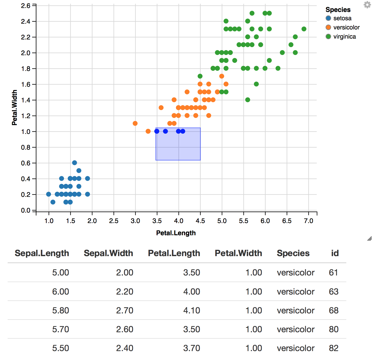
Figure 2.12: an example of linked brushing between ggvis plots
This image is static. Click here to view this example.
However, we are still left with a general problem of shiny (with the exception of ggvis) recomputing and redrawing a plot or widget every time an input changes. As of writing, work has been developed to prevent plots generated by plotly to only change certain parts of a plot whenever a plot is implemented with shiny. In a recent version of plotly (version 4.7.1), Sievert(2017a) has shown that this is possible with a new feature called plotlyProxy(), but requires knowledge of the plotly.js library and how these proxy objects work.
2.4 animint
animint (Hocking et al. 2017) is an R package designed to allow users to create interactive and animated visuals using ggplot2. It uses the concept of direct manipulation defined in Scheiderman (1982). It focuses on adding two main aesthetics to ggplot2 - clickSelects to allow the user to click on a selection, and showSelects that shows the current selection. The user is able to directly click on the plot, which can be used to link multiple views of data on the same page. It uses D3 to generate the interactive plot on the page, and stores all the data in multiple TSV files that can be viewed locally.
To illustrate, we create a simple example linking between gender and highest qualification to identify if there is a difference in income from the nzincome data set (Figure 2.13). When we click on the bars of the plot (left), we can subset the data by gender, while we can further subset the groups into qualification by selecting the legend on the scatter plot on the right. Overall, across all qualification groups, there appears to be a difference between income levels by gender.
Figure 2.13: animint example linking a bar plot by gender to weekly hours and income from the nzincome data set
library(animint)
plot1 <- ggplot(income) + aes(x = sex, clickSelects = sex) + geom_bar()
plot2 <- ggplot(income) + aes(x = weekly_hrs, y = weekly_income, showSelected = sex,
                              color = highest_qualification) + geom_point()

plotAll <- (list(p1 = plot1, p2 = plot2))
structure(plotAll, class = "animint")
If the figure above does not show, please view this page on Firefox instead.
If we click on any of the bars on the bar plot (left), the scatter plot (right) shows the selected points that correspond that that group.
Hocking’s (2017) example of the displaying different views of the World Bank dataset shows how complex interactive and animated plots can be achieved with less than 100 lines of code. It is simple and straightforward, and is not restricted to linking scatter plots as discussed with crosstalk and plotly. Because plots are rendered entirely in JavaScript using D3, they are relatively more responsive and faster than compared to using a client-server framework like shiny which has an overhead cost from communicating between a remote server with R and the browser.
The key strength of animint is also its weakness as the only type of interactivity that can be achieved is clicking and showing what has been selected (Hocking et al. 2017). Currently, it cannot achieve brushing or zooming and is only compatible with ggplot2. For more advanced users of ggplot2, not all geoms are supported, and may remain static when rendered with animint. Furthermore, because everything is computed and rendered beforehand, this means that if a selection requires a re-computation in R before it can be displayed, this is not possible. Hocking (2017) suggests that a solution to this is to use animint with shiny, but this means that a new animint plot is rendered every time the user interacts with it. The unfortunate situation with creating stand-alone interactive plots this way is that the amount of data that needs to be generated to power the plots increases as we increase the number of subsets. If a data set has multiple subsets that need to be rendered, animint will need to make all the different combinations for each subset to link every plot together. The bigger the number of subsets and the larger the dataset, the number of files that need to be generated to drive the interactive or animated plot increases. In this case, using a client-server framework like shiny would be more suitable.
The animint package is promising for implementing a complex system that achieves interactive and animative plots that can be easily linked and implemented by users using clicks and selection, but there is still a great deal that it cannot do.
2.5 Summary
From assessing all these tools, we can summarise the features and drawbacks for each tool in the table below.
| Tool | Type of plot | Compatible with shiny | Types of interactions | Redraws entire plot | Framework type |
|---|---|---|---|---|---|
| plotly | plotly(plotly.js), ggplot2 | Yes | Clicks, brushing, subsetting, filters, zooming, rescales, linking multiple views with crosstalk (focuses more on on-plot interactions) | Yes (unless proxy) | standalone HTML |
| ggvis | ggvis(Vega) | Yes | off-plot interactions, hovers, brushing (with crosstalk), filters, rescales (focuses more on off-plot interactions) | No | client-server |
| shiny | R plots, anything compatible with it | - | clicks, brushing, filters, subsetting, hovers, able to link views (both on-plot and off-plot possible) | Yes | client-server |
| animint | ggplot2 (D3) | Yes | clicks + selects | No (unless used with shiny) | standalone HTML |
Table 1: A summary table of all the tools available and their main capabilities
Note: anything that is compatible with shiny will end up adopting its client-server framework.
Most of these tools can be extended using shiny. However the general problem is that when these systems are implemented with shiny (with the exception of ggvis), every time a user interacts with an input, the whole plot or corresponding widgets will be recomputed and redrawn. Furthermore, many of these do now allow us to customise our own interactions into the plot. We can use these tools for easily visualise our data with standard interactive plots, but if the user wishes to customise interactivity or extend it further, it presents a dead end or a need for learning its respective API. The other significant factor is that most these tools use a JavaScript library to render their plots. While graphics plots generated in R are supported by shiny and ggplot2 across plotly and animint, there is no support for graphics generated with other plotting systems in R. Next, we will look at how we can achieve specific on-plot interactions on static R plots by combining JavaScript with lower levels tools and avoid reproducing entire plots whenever the user interacts with it.
References
Bostock, Michael, Vadim Ogievetsky, and Jeffrey Heer. 2011. “D3 Data-Driven Documents.” IEEE Transactions on Visualization and Computer Graphics 17 (12). Piscataway, NJ, USA: IEEE Educational Activities Department: 2301–9. doi:10.1109/TVCG.2011.185.
Chang, Winston, and Hadley Wickham. 2016. Ggvis: Interactive Grammar of Graphics. https://CRAN.R-project.org/package=ggvis.
Chang, Winston, Joe Cheng, JJ Allaire, Yihui Xie, and Jonathan McPherson. 2017. Shiny: Web Application Framework for R. https://CRAN.R-project.org/package=shiny.
Cheng, Joe. 2016. Crosstalk: Inter-Widget Interactivity for Htmlwidgets. https://CRAN.R-project.org/package=crosstalk, https://rstudio.github.io/crosstalk/.
Cheng, Joe, Bhaskar Karambelkar, and Yihui Xie. 2017. Leaflet: Create Interactive Web Maps with the Javascript ’Leaflet’ Library. http://rstudio.github.io/leaflet/.
Gesmann, Markus, and Diego de Castillo. 2011. “GoogleVis: Interface Between R and the Google Visualisation Api.” The R Journal 3 (2): 40–44. https://journal.r-project.org/archive/2011-2/RJournal_2011-2_Gesmann+de~Castillo.pdf.
Hafen, Ryan. 2016. Rbokeh Version 0.5.0 Released. http://ryanhafen.com/blog/rbokeh-0-5-0.
Hafen, Ryan, and Inc. Continuum Analytics. 2016. Rbokeh: R Interface for Bokeh. https://CRAN.R-project.org/package=rbokeh.
Hocking, Toby Dylan, Susan VanderPlas, Carson Sievert, Kevin Ferris, Tony Tsai, and Faizan Khan. 2017. Animint: Interactive Animations. https://github.com/tdhock/animint.
Kunst, Joshua. 2017. Highcharter: A Wrapper for the ’Highcharts’ Library. https://CRAN.R-project.org/package=highcharter, https://github.com/jbkunst/highcharter.
RStudio. 2017a. Interactive Plots. https://shiny.rstudio.com/articles/plot-interaction.html, https://shiny.rstudio.com/articles/plot-interaction-advanced.html.
———. 2017b. Selecting Rows of Data. https://shiny.rstudio.com/articles/selecting-rows-of-data.html.
———. 2017c. Shiny. https://shiny.rstudio.com/.
———. 2017d. Shiny Server. https://www.rstudio.com/products/shiny/shiny-server/.
Sievert, Carson. 2017a. Plotly 4.7.1 Now on Cran. http://moderndata.plot.ly/plotly-4-7-1-now-on-cran/.
———. 2017b. Plotly for R. https://plotly-book.cpsievert.me/.
Sievert, Carson, Chris Parmer, Toby Hocking, Scott Chamberlain, Karthik Ram, Marianne Co rvellec, and Pedro Despouy. n.d. Plotly: Create Interactive Web Graphics via ’Plotly.js’. https://plot.ly/r, https://cpsievert.github.io/plotly_book/, https://github.com/ropensci/plotly.
Trifacta. 2014. Vega. https://vega.github.io/vega/.
Vaidyanathan, Ramnath. 2013. RCharts: Interactive Charts Using Javascript Visualization Libraries.
Wickham, Hadley. 2016. Ggplot2: Elegant Graphics for Data Analysis. Springer-Verlag New York. http://ggplot2.org.
Wickham, Hadley, and Winston Chang. 2016. Interactivity. http://ggvis.rstudio.com/interactivity.html.
Wilkinson, Leland. 2005. The Grammar of Graphics (Statistics and Computing). Secaucus, NJ, USA: Springer-Verlag New York, Inc.
Xie, Yihui. 2016. DT: A Wrapper of the Javascript Library ’Datatables’. http://rstudio.github.io/DT.